Oops! Something went wrong while submitting the form.
Notice: It looks like you are visiting us from United Arab Emirates or have selected it as your residency location.
For accurate information and services under the correct licensed entity, please visit the appropriate section of our website. For more information view Regulatory Information
For accurate information and services under the correct licensed entity, please visit the appropriate section of our website. For more information view Regulatory Information
For some, trading is the primary source of income, while for the rest, it is an excellent way to generate passive earnings. Understanding the chart patterns is critical to realising what prices might do in the future. Technical analysis requires the use of trading chart patterns as key instruments. The recurring nature of market behaviour causes these patterns to appear as visual representations on a price chart.
However, it’s easier said than done, and that’s why this article aims to help you understand different trading patterns. We'll examine several popular patterns and their traits and how to use them to make wise trading choices. By the conclusion, you will know how to read trading patterns and have practical advice on incorporating them into your techniques.
[[aa-key-takeaways]]
Key Takeaways
Understanding trade patterns is essential for forecasting future price fluctuations based on past market behaviour.
These patterns offer visual indicators on price charts that represent shifts and possible opportunities.
Traders employ technical analysis tools to properly control risk and validate breakout locations.
Over time, mastering chart patterns and refining trading methods require constant learning and observation.
[[/a]]
Types of Common Chart Patterns
Before we begin, let’s point out that it’s impossible to say which pattern or technique is the best or optimal for you, considering how many trading patterns there are. Also, everything depends on your strategy. Research and in-depth knowledge just give you more chances of success when it comes to reading charts.
Overview of Reversal Patterns
Reversal patterns suggest that a current trend's direction will shift. These patterns emerge when a change results in a reversal of the trend. These patterns include the head and shoulders chart pattern, the double top chart pattern, and the double bottom pattern, which we will discuss below in detail. In a head and shoulders pattern, the shoulder is the first peak, the head is the second peak, and the shoulder is the third peak.
Frequently, this pattern signals a bearish reversal. The "M"-shaped double top pattern indicates a possible trend change from a bullish pattern to a bearish one. On the other hand, the "W"-shaped double bottom pattern points to a potential bullish trading pattern reversal.
Information About Continuation Patterns
The continuation pattern suggests the current trend will probably continue following a short break. These trends imply that the market is lulling before resuming its upward trajectory. Pennant chart patterns, flag patterns, and triangle chart patterns, such as the ascending and descending triangles, are a few examples of continuation patterns. A pennant chart pattern forms a small, symmetrical triangle, indicating a consolidation time before the trend resumes. A tiny rectangle that slopes against the primary trend makes up the flag pattern, which denotes a brief period of consolidation before the trend resumes. Combining trend lines in triangular patterns, like the ascending and descending triangles, indicates that the trend will continue if the price breaks out.
We discussed two ways of perceiving and reading these charts. By being aware of these crucial features, you may use technical analysis to make well-informed decisions by assessing the likelihood that a trend will reverse or continue.
Reversal Chart Patterns
In this section, we will break down common trading patterns valued and often used by experienced traders.
Head and Shoulders
A notable bearish reversal pattern on the chart, as well as the head and shoulders pattern, indicates that an upward trend may be coming to an end. There are four primary parts to it:
After rising to a high, the price falls to create a bottom.
The price starts to fall after rising once more and surpassing the initial peak.
The price only reaches the first peak's level during its third increase before falling once more.
Joining the troughs creates the neckline.
When the price breaks below the neckline, the pattern is finished. This rupture suggests a possible trend decline. The head-and-shoulders pattern has three peaks: two smaller peaks (shoulders) surround the highest central peak.
Traders use this pattern to determine entry and exit locations. The stop loss is typically above the right shoulder, while the breakout point is typically below the neckline. The profit objective is calculated by deducting the breakout point from the length of time between the head and the neckline.
Inverse Head and Shoulders
The head and shoulders bottom, also known as the inverse head and shoulders pattern, is a bullish reversal pattern that suggests a possible shift from a downward to an upward trend. We can also regard it as the four-part cycle:
The cost decreases to a minimum and then increases.
The price dips lower once again before rising once more.
The price dips a third time, although not to the second point's level, before rising again.
Joining the peaks creates the neckline.
The price breaking above the neckline in this pattern indicates a reversal. Three slopes define the inverse head and shoulders pattern: the main trough (head) is the lowest and is flanked by two shallower troughs (shoulders).
When a possible bullish trend is indicated, traders watch for a breakout over the neckline. The distance between the head and the neckline is measured and added to the breakout point to determine the profit objective.
Traders employ the well-known head-and-shoulders and inverse head-and-shoulders patterns to predict future price moves. Recognising these patterns enables them to use technical analysis tools more effectively, resulting in more precise forecasts of market trends and possible reversals.
Double Top
In technical analysis, a double top is a bearish pattern that appears when an asset hits a high twice in a row with a slight fall in between, as seen in an illustration above. The pattern is established when the asset's price drops below the support level created by the low between the two highs. A possible medium- or long-term trend shift from bullish to bearish is indicated by a double top. Traders anticipate additional drops and use this pattern to signal a trend reversal. They frequently view this as a chance to sell or enter short positions.
Double Bottom
A bullish reversal pattern that follows a downward trend is called a double bottom. It is composed of a peak and two successive low points. If you look closely at the chart, it resembles the letter "W." The pattern suggests that the price has found a level of support twice but has not broken through. This setback raises the possibility of a bullish trend reversal. Traders frequently interpret the twin-bottom pattern as an indication to buy or start long positions expecting a price gain.
Triple Top
A bearish reversal pattern, a triple top, develops following a lengthy uptrend. There are two slight declines between each of its three peaks at about the same price level. This pattern suggests that market sentiment may be turning from bullish to bearish. When the resistance level is consistently broken, it indicates fading purchasing pressure. Expecting a downward trend, traders see the triple top as a signal to sell or enter short positions.
Triple Bottom
A bullish reversal pattern known as a triple bottom develops following a downward trend. It comprises three successive lows at or near the same price, forming a support zone. The trend suggests no more extended room for price decreases because demand has outpaced supply. This consistent support points to a possible bearish to positive trend reversal. In anticipation of upward future price movements, traders utilise the triple bottom as a signal to buy or initiate long positions.
Rounding Top
One important price pattern in technical analysis is a rounding top. The chart shows that daily price fluctuations resemble an upside-down "U" and create a downward-sloping curve indicating this pattern. It frequently appears towards the conclusion of a lengthy upward trend, indicating a possible long-term price movement reversal. This pattern may ultimately take days or even years to emerge, suggesting a prolonged shift in the trend.
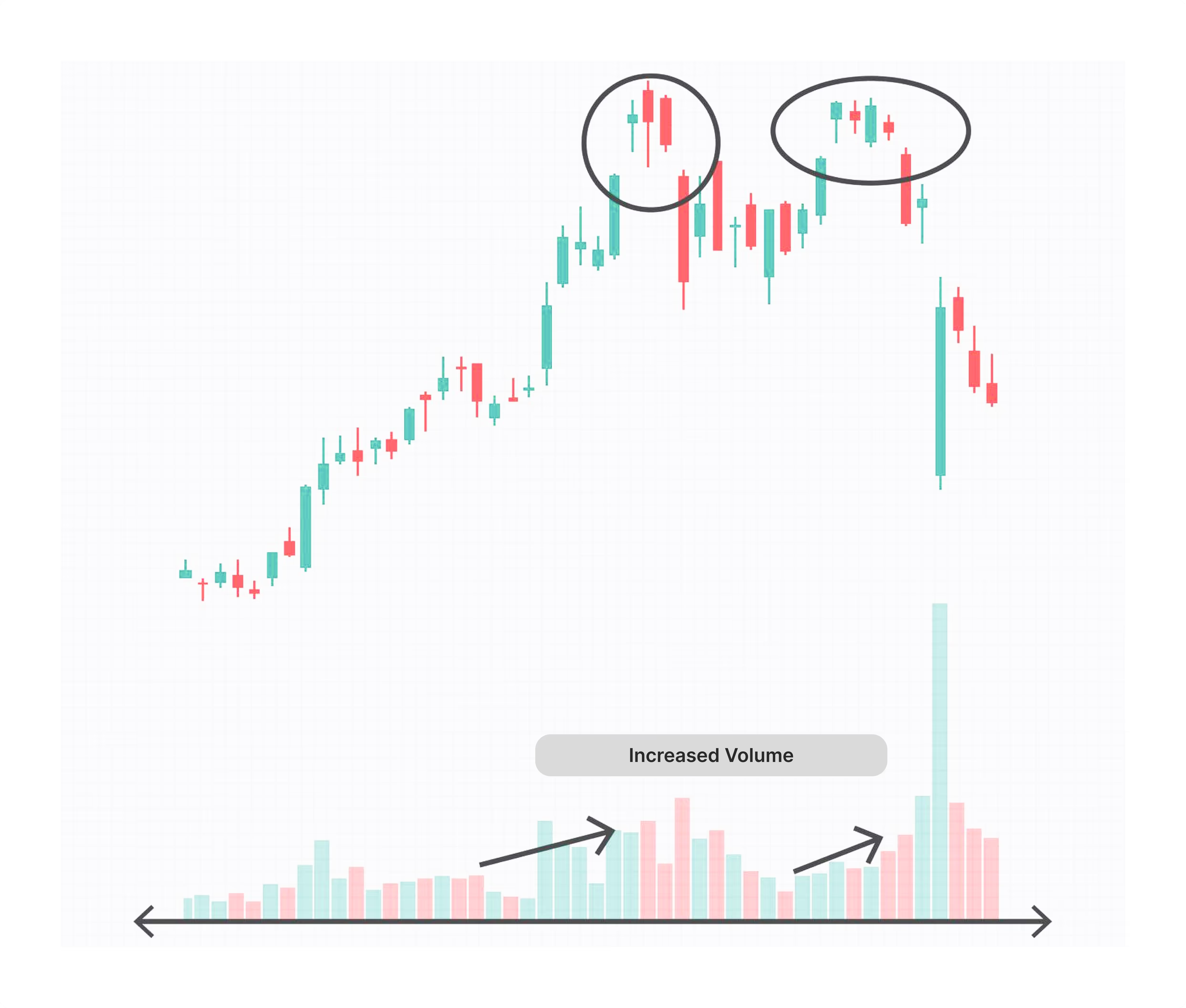
When a rounding top is observed, traders expect a change in price from rising to falling. The price hits a new high before progressively falling and taking on a rounded shape. Volume often reaches high during the price rise and can do so again during the selloff. Traders can profit from this trend, avoid adverse market conditions, or use short-selling for declining prices.
Rounding Bottom
A chart pattern called a rounding bottom is used to spot possible turns from a falling trend to an upward one. On a price chart, it resembles a "U" and denotes a slow transition from bearish to bullish emotion. The duration of this pattern varies from weeks to months, suggesting a long-term shift in direction.
The pattern begins with an asset's price declining due to an excess supply. Buyers reenter the market as the price bottoms out, generating demand and pushing the price higher. When the rounding bottom breaks above the prior high, it is complete. Volume usually increases as prices rise, confirming the price action. This trend points to a favourable reversal where investors are growing more optimistic.
Island Reversal
A unique price pattern seen on daily charts is called an island reversal. It is defined by gaps in the price movement that separate a group of trading days. This pattern suggests that the present trend may be about to reverse, either upward or downward. Island reversals can be seen in trading candlestick patterns and bar charts alike.
The pattern creates an isolated "island" of prices, consisting of a significant price gap heading into a group of trading days and another gap leading out. Typically, there is a high volume gap initially, a trading window within a predetermined range, and a final gap solidifying the island. At market peaks, island reversals are frequent and suggest a bearish reversal.
[[aa-fast-fact]]
Fast Fact
Trading charts have their roots in the 18th century when Japanese rice merchants invented candlestick charting, a revolutionary method of technical analysis. Using "candles" to graphically depict opening, closing, highest, and lowest prices over a certain period is known as candlestick charting.
[[/a]]
Continuation Chart Patterns
Now, we will continue with the chart patterns every trader should know about. As we mentioned earlier, Continuation patterns indicate that once the pattern is finished, the current trend will probably continue.
Rectangle
When the price fluctuates between horizontal support and resistance levels, it forms a rectangle pattern that signals a consolidation phase. Traders can identify this pattern by drawing horizontal lines that join the highs and lows to form a rectangular shape. Here are some of the relevant chart patterns:
The price swings between a clearly defined upper resistance level and a lower support level.
The price goes horizontally, indicating that the pattern lacks a distinct trend.
A breakout occurs when the price swings outside the rectangle, either upward or downward, signalling the end of the pattern.
At the resistance level, traders sell, and at the support level, they buy.
Before making a trade in the breakout direction, traders watch for the price to break out of the rectangle.
The rectangle pattern assists traders in locating key regions of support and resistance, enabling them to base their trading decisions on probable future price moves.
Wedge
Converging trend lines connecting the price series' highs and lows over ten to fifty trading sessions indicate a wedge. This pattern may indicate potential price movement reversals. Here are the characteristics:
The wedge-shaped pattern formed by the trend lines indicates that the highs and lows either rise or decrease at separate rates.
Usually, when the price passes through the wedge, the volume decreases.
A breakthrough from one of the trend lines completes the pattern.
It suggests a turnaround in the negative. It happens when the price is increasing but breaks below the lower trend line, indicating that a fall may be coming.
Indicates a bullish turnaround. It appears when the price declines and implies a rise may follow after it breaks above the top trend line.
Wedge patterns can indicate both trend reversals and continuations. In an uptrend, a rising wedge might point to a reversal, while in a downtrend, a falling wedge might point to a trend continuation.
Ascending Triangle
Now, we begin discussing triangle patterns trading with three different forms. An ascending triangle pattern is a bullish configuration that suggests future price increases. It comprises two trendlines: a rising lower trendline that indicates growing support levels and a flat higher trendline that serves as resistance. The price produces higher lows as it moves between these levels, suggesting that sellers weaken. The price indicates the beginning or continuance of an uptrend when it ultimately breaks above the resistance line. This pattern frequently occurs during an overall rise and acts as a brake before the subsequent price spike. To minimise risk, traders place stop-loss orders below the pattern's lowest point and wait for a breakout over the resistance line to validate the pattern before considering taking long positions.
Descending Triangle
A descending triangle pattern indicates a good chance that the price will continue to decline. It is distinguished by a descending upper trendline that denotes lowering resistance levels and a flat lower trendline that serves as support. The price establishes lower highs as it moves between these levels, indicating buyers are losing steam. A further decrease occurs when the price breaks below the support line, confirming the descending triangle pattern. This pattern typically develops during a decline, keeping the trend going. Traders usually use the pattern's highest point as a stop-loss level and wait for the price to break below the support line before initiating short trades.
Symmetrical Triangle
A symmetrical triangle is a neutral formation that might point to a trend reversal or continuation. It has two converging trendlines that constitute a shrinking price range: a rising lower trendline and a sinking upper trendline. The price moves toward the triangle's apex, fluctuating between these lines. The direction of the next big move is indicated by the price breaking out of the triangle. A breakout that points in the direction of the dominant trend predicts that it will continue; a breakout that points in the other direction suggests that it will reverse. To control risk, traders place stop-loss orders at the pattern's extremes and watch the breakout to identify entry points.
Flag
A continuation signal that follows a significant price movement is known as a flag pattern. The chart above indicates that the flagpole comprises a small, flag-like, rectangular consolidation area that slopes against the previous trend. A bullish flag forms when prices consolidate downward during an uptrend; when prices consolidate upward during a decline, a bearish flag appears. The earlier trend will resume when the flag pattern breaks out. Volume patterns are what traders look for to validate the breakout direction. Entry locations are determined following the breakout, and stop-loss orders are put outside the flag's range to reduce possible losses.
Closing Thoughts
After reading the article, you already know several ways to make wise decisions and predict future price movements. Identifying these patterns will assist you in determining possible trends and entry and exit opportunities. Visual forms on price charts that indicate changes in market behaviour are referred to as chart patterns.
However, learning never ends in this industry. Expert traders have spent multiple hours and years of their lives gaining experience in understanding chart trends and behaviour. So, remember that success requires neverending improvement and daily observations of these charts.
[[aa-faq]]
FAQ
Do Trading Patterns Actually Exist?
Chart trends are shaped by trading patterns, which mirror the market's supply and demand dynamics. Although these patterns can point to future moves, they are not always accurate and ought to be utilised in conjunction with other market analysis methods.
How Do Trading Patterns Make Sense?
A sequence of higher highs and lowers and trendlines connecting at least two lows to provide support levels indicates an uptrend. On the other hand, lower highs and lower lows characterise a downtrend, while trendlines connecting at least two highs indicate resistance levels.
Trading Chart Patterns: What Are They?
Chart patterns are distinct forms that appear on price charts and, based on past data, indicate potential future price movements. Technical analysis relies heavily on these patterns, which traders must correctly identify and understand in order to forecast market movement.
[[/a]]
Connect with Our Experts
Our team is equipped to provide solutions precisely to your requirements. Let's explore your options and discuss how we can support your objectives


.svg)